
For this design, here are your polishes:
- Wet n Wild clear
- Wet n Wild "Bijou Blue"
- China Glaze "Kiwi Cool-Ada"
- Milani 3D "Hi-Tech"
- Prestige gold
To accomplish it, start with a clear base. I used two coats of the blue near the base of each nail and then two coats of the neon green on the remaining 2/3s of the nail. The green should overlap the blue to it looks like they smoothly melt into each other. Then apply some of the green sparkles courtesy of the Milani 3D polish, I tried to keep the green sparkles on the green half of the nails, although it looks fine if it is applied to the blue as well. At this point it would be wise to seal the base colors with a coat of clear.
For the Triforce, slowly start with a dot of the gold polish. The Prestige polish I used is extremely old and very transparent, so I really had to work at making each triangle on the middle three fingers. It took several coats (4~) for those three little shapes! Just work at it slowly, starting with a dot and dragging out left, right and upper corners. It may help to start with a straight horizontal line and then add a dot ontop of the line and work from there. Persistence and patience are key :) Once you've got the triangles into vaguely triangle shape, seal the three fingers with more clear and give them plenty of time to dry.
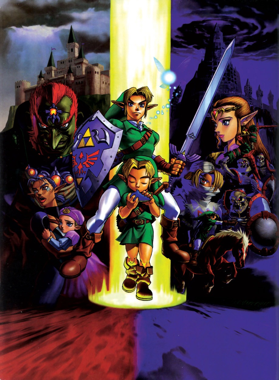
Much less intensive than some of my other designs, this design I feel gets the feel of Ocarina of Time across in a subtle way. I have a poster for the game that is extremely heavy on blues, and the game of course is heavy on green and brown and gold. Some of the later games are more heavy on lighter colors or on darker colors, but based on this poster alone, the bright blue and green call Ocarina of Time to mind, and the Triforce is an easy symbol to add to the color scheme as well.
No comments:
Post a Comment